Paleo MODIS
I have an idea.
When a satellite takes an image of Earth’s surface, the color that it sees is a function of land cover – trees, water, ice, sand. The spatial distribution of those land covers depends on everything from plate tectonics to seedling germination, but I’m betting you can make a decent guess at predicting land cover, and by extension surface color, using just climate.
Cold and wet? Probably a boreal forest (green). Hot and dry? Probably a desert (yellow). Cold and dry? Probably ice and snow (white).
If we can train a model to approximate that function and predict Earth’s surface color today using modern satellite imagery and climate data, can we simulate a satellite image of the last ice age using paleoclimate data modeled to 22,000 years ago?
Only one way to find out.
The Data
To predict historical satellite imagery, we’ll need three things:
- Modern satellite imagery.
- Modern climate data.
- Paleoclimate data.
The last one is going to be the hardest to find and will constrain the spatial resolution and variables of the other two, so I started there and worked backwards.
Paleoclimate Data
After a few hours digging through impenetrable metadata and early 2000s web design on climate data portals1, I finally stumbled on WorldClim Paleo 1.4, a downscaled version of CMIP5 modeled at the last glacial maximum (LGM). The dataset includes 19 bioclimatic variables derived from temperature and precipitation, e.g. max temperature of the warmest month, precipitation of the wettest month, that should hopefully be good predictors of land cover and surface color.
With a little data wrangling to scale and merge the single-variable GeoTIFFs into one multi-band raster, I moved onto the modern climate data.
Modern Climate Data
Like the paleo data, this came from WorldClim. The WorldClim 2.1 dataset includes the same 19 bioclimatic variables modeled to 1970-2000 CE, providing training data that we can pair with modern satellite imagery.
Speaking of which…
Modern Satellite Imagery
To model Earth’s surface color, we’ll need satellite imagery with global coverage, enough observations to generate a cloud-free mosaic, and adequate spatial resolution in the visible spectra. I went with MODIS Terra, and wrote a quick script to process and export an annual median RGB2 mosaic of 20203 imagery from Earth Engine, aligned to the climate data grid4.
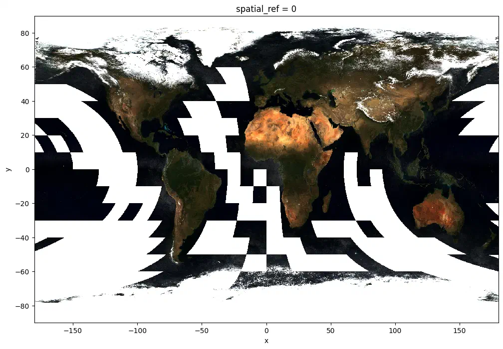
MODIS 2020 annual mosaic in RGB. Most of the ocean is masked, which is fine since our climate data is restricted to land anyways.
The Model
There are a lot of ways you could approach modeling surface color from climate data, but I decided to start simple; if we can get a decent output using a random forest and tabular data, we’ll save a lot of time and effort compared to a fancy convnet.
Point Sampling
To train an RF model, we’ll need a table of pixels sampled from across the globe with all of the bioclimatic predictors and spectral targets extracted. Once again, I opted for a quick and dirty solution, sampling every 20th pixel by latitude and longitude to collect a 200 x 200 minute grid of points, of which about ~1900 were land measurements with both climate and spectral reflectance. This naive approach led to oversampling near the poles where longitude lines converge, but I decided this was something that could be solved if it became a problem.

Sample points on a 200 minute grid, color-coded by modern temperature range. Note the increasing sample density as longitude lines converge at the North Pole.
Another detail that I decided to gloss over was human impact – changes in surface color resulting from deforestation or urbanization won’t be predictable from climate, obviously. Fully excluding anthropogenic effects would be impossible, but you could probably reduce bias in the prediction by excluding samples in heavily modified areas. Something to revisit in version 2.
Training the Model
With the sample points extracted to a dataframe, training the model just required splitting predictors and targets into X and y arrays and passing them into a scikit-learn random forest regressor. In a familiar pattern for this project, I went for the quick solution and didn’t bother with any kind of test validation. Since we’re just aiming for a visually interesting output, the validation will ultimately be how realistic it looks.
Predicting Surface Color
Modern Earth
We have a random forest model trained with modern satellite imagery and modern climate to predict surface color, so let’s see how well it can recreate the training imagery from MODIS.
Here’s the real MODIS again5:
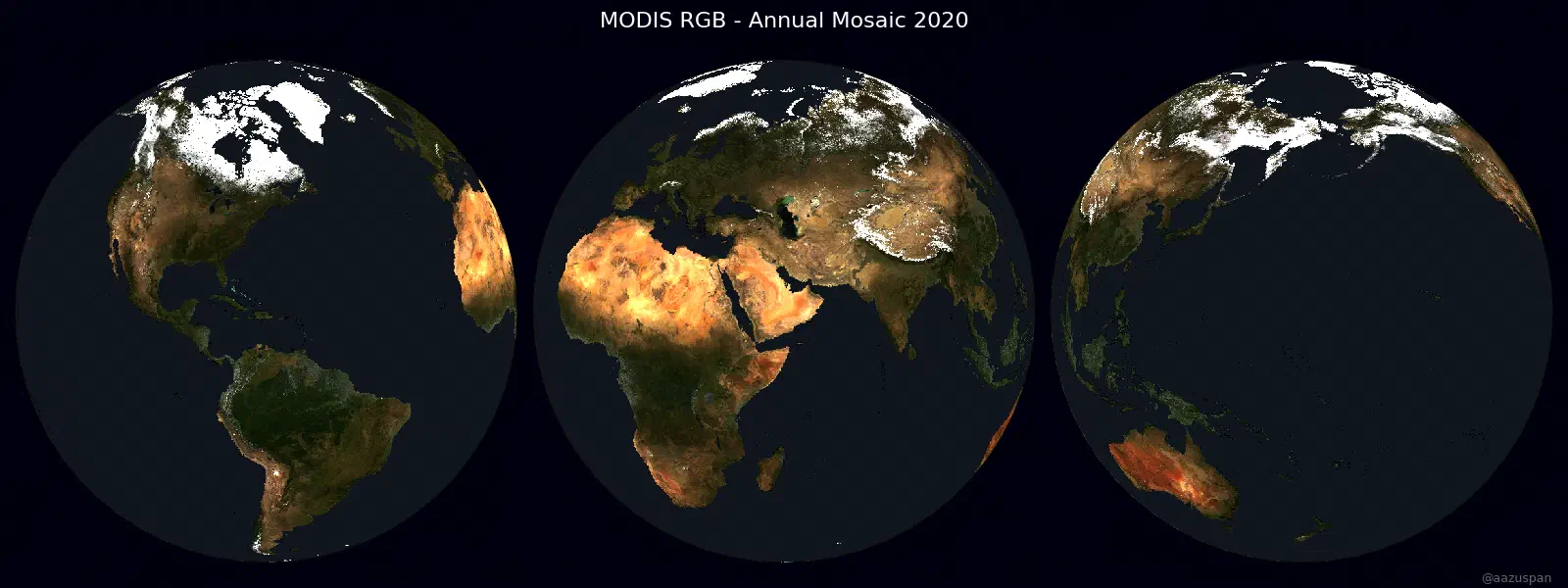
MODIS annual mosaic 2020.
And predicted MODIS based only on modern climate:
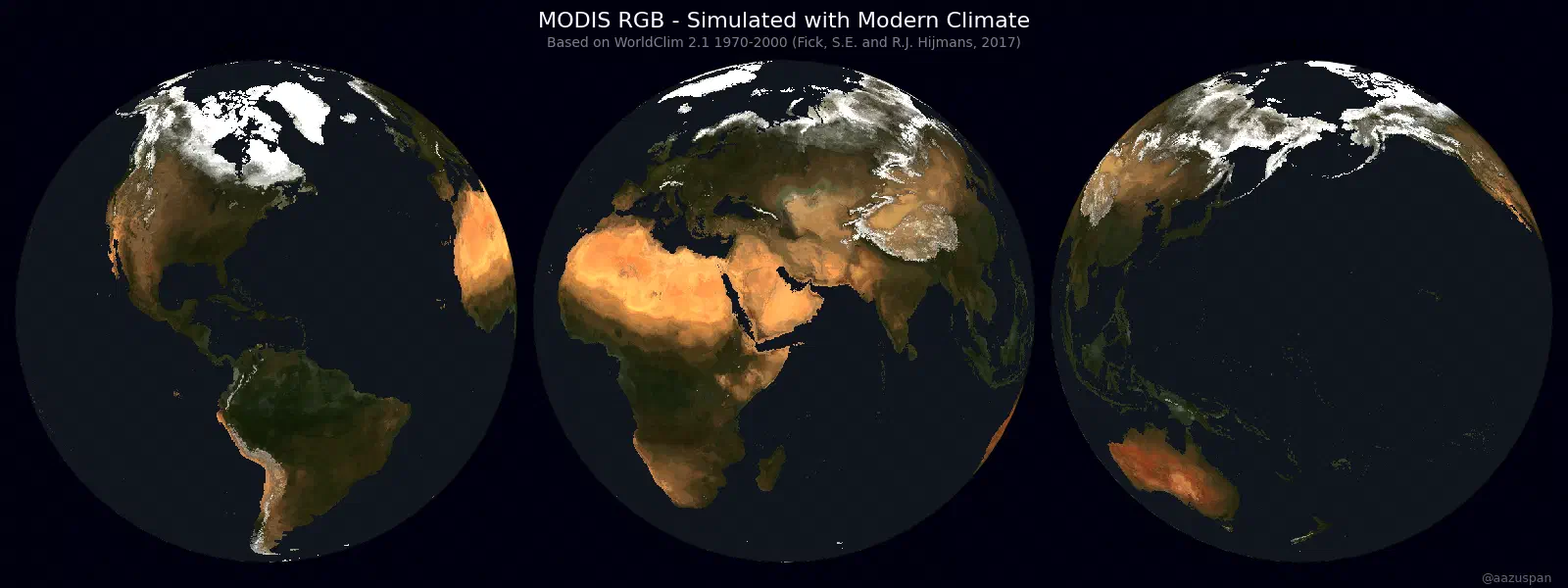
Predicted surface color from modern climate 1970-2000.
Not bad! Some of the finer details of soil and topography are missing, but the random forest is predicting a realistic distribution of land cover, including snow and ice in the Arctic and high mountain ranges, deserts in northern Africa an Australia, and dense tropical forests in the Amazon and south-east Asia.
Earth at the Last Glacial Maximum
With the model synthesizing realistic satellite imagery from modern climate, it’s time to feed it paleoclimate data and get our first look at Earth 22k years ago, during the last glacial maximum:
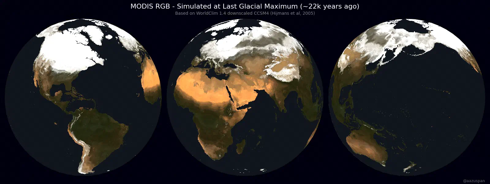
Predicted Earth surface color during the last glacial maximum 22,000 years ago.
The first thing I noticed is ice and snow in the northern hemisphere, which covers the American midwest and most of Europe. This looks reasonably consistent with projected glacial extent during that time period, lending a little bit of credibility to this simulation. The second thing I noticed is the increased land area, which was baked into the paleoclimate predictors and represents a sea level that was approximately 125 meters lower than it is today, exposing coastlines and connecting island chains.
Otherwise, Earth looks remarkably familiar to its current state. Just colder6.
Note: This started out as a thread on BlueSky, which you can see below.
Am I too late for #30DayMapChallenge Day 14 - A World Map? I trained a model to predict MODIS RGB imagery from modern climate and applied it to modeled paleoclimate data to simulate a 22,000 year old satellite image of Earth
— Aaron Zuspan (@aazuspan.dev) 2024-12-08T20:15:01.805Z
No disrespect meant to the folks who create, publish, or maintain climate datasets, but there’s a lot of room for making climate data more accessible to non-experts like me. Formats like Zarr and datasets like ARCO ERA5 are a very exciting step in that direction, but it seems like the majority of data products are still locked behind inscrutable data portals and scattered across dozens of single-variable NetCDFs. ↩︎
I experimented with transforming the satellite imagery into HSV and LAB space prior to fitting the model, but ultimately found that RGB with a percentile stretch gave the best visual results. ↩︎
I wasn’t concerned with matching the imagery year exactly to the climate period, since 2020 land cover was presumably influenced by decades to millennia of preceding climate. ↩︎
Aligning the Earth Engine export to match a local raster grid was surprisingly tricky, so I wrote up a short guide. ↩︎
These figures were created with Cartopy using a nearside perspective projection that I sneakily tipped towards the North Pole to hide the fact that the paleo climate data excludes Antarctica. ↩︎
If you’re wondering, I did try simulating “future Earth” with projected climate change. Given the lack of validation in this approach and my generally limited understanding of climate models, I decided not to include that here. ↩︎