Visualizing Encoded GeoTIFFs with Space-Filling Curves
I recently stumbled onto a blog post by Aldo Cortesi about using space-filling curves to visualize the structure of bytes within a binary file. The underlying idea is that if you wrap a curve so that it touches every point on a 2D grid once, you can project data from one-dimensional positions on the curve (e.g. byte offsets) to two-dimensional coordinates on the grid (e.g. pixels). By projecting nearby locations in the file to nearby locations in the image1 and mapping byte values to colors, you can visualize spatial patterns in the data and get some intuitive understanding of how the file is encoded.
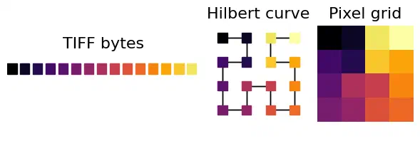
Projection from a 1D byte stream to a 2D pixel grid along a space-filling Hilbert curve, color-coded by the byte value.
I’ve spent the last couple weeks hunting a bug where Dask arrays written on-the-fly with rioxarray create much larger compressed GeoTIFFs than the same data written from memory2, which has given me a lot of excuses to poke into the internals of the TIFF file format. So naturally, my first thought after reading about the technique was to try running it on some GeoTIFFs.
The defaults
I started by writing out a simple, uncompressed 64 x 64 single-band uint8 GeoTIFF with the rasterio default settings. To help visually map from the image pixels to the projected bytes, I applied a horizontal gradient from 0-255 and color-coded the 4,462 resulting bytes by their magnitude.
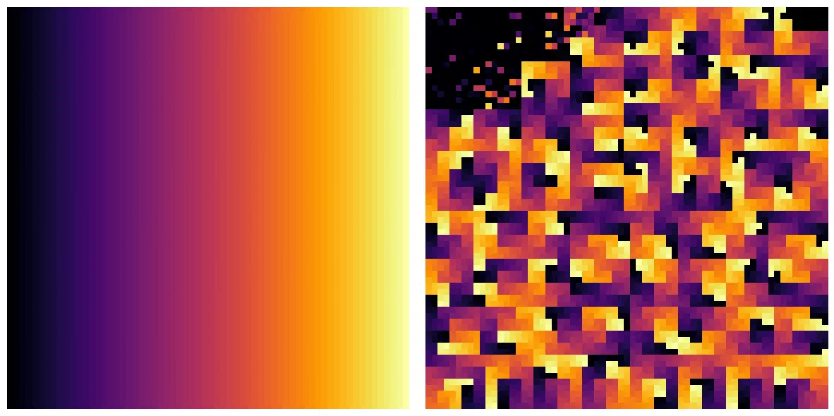
The color-mapped pixel data (left) and its encoded binary data (right).
At the top-left of the encoded image, you can see the TIFF headers which contain all the file metadata and spatial reference information. The pixel data occupy the remainder of the space.
The headers contain a mix of different word lengths and are a little tricky to visualize, so I decided to drop those and just focus on the 4,096 bytes of pixel data for the rest of the experiments.
Speaking of which.
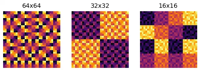
Chunk sizes
The default export used a single block for the 64 x 64 image. Splitting it into smaller blocks with the blockxsize and blockysize arguments clearly segregated high and low values into alternating blocks in the uncompressed GeoTIFF.
Interleaving
Interleaving doesn’t have any effect with a single-band, but by creating a new image with two bands – one with even values and one with odd values – and color-coding bytes red or blue based on the source band, I was able to compare the effects of band- and pixel-interleaving on file layout.
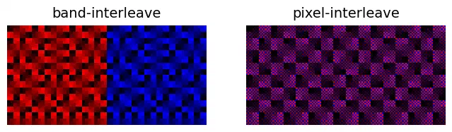
The band-interleaved TIFF stored the first band (red) first followed by the second band (blue), while pixel-interleaving alternated bands at each byte, creating a blended image that looks purple.
Compression
Finally, I decided to see how compression would affect file structure by comparing the single-band image again after applying LZW and Deflate compression.
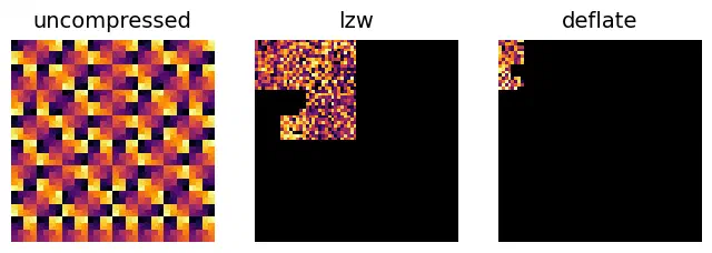
Unsurprisingly, compression dramatically reduced the amount of data in the GeoTIFFs, from 4,096 bytes in the uncompressed file to just 501 bytes in the deflated file. The repeating spatial patterns are gone, replaced with compressed codewords that just look like random noise.
The mysteriously large GeoTIFF
Going back to the bug that motivated this exploration, I tried visualizing the bytes of a compressed GeoTIFF written from memory with a seemingly identical, but much larger file written chunk-by-chunk from Dask. While the pixel byte ranges looked identical, including the entire file comfirmed just how much binary gibberish is being written into the larger file.
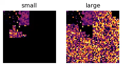
Encoded bytes from two compressed GeoTIFFs with identical headers and pixel data. The TIFF on the right was written lazily from a Dask array and contains some mysterious, garbage binary data.
While the visual confirmation is nice to have, I can’t say I’m any closer to figuring out exactly what’s going on here.
Not all space-filling curves preserve locality. This is one advantage of the Hilbert curve (and the generalized form for non-square outputs called the Gilbert curve, which I’m using here). ↩︎
I might make a separate write-up if I ever figure out exactly what’s going on. What I do know is that the abnormally large files contain identical pixel data, but it’s located much later in the file due to high strip offsets, leading to ~10x increases in file size (depending on the block sizes). I can see how determining byte offsets without knowing the full compressed size beforehand would be tricky, but the fact that the files are frequently larger than their uncompressed equivalents seems wrong. ↩︎